
Earth Forms | Museum of Modern Art
Promoting An Exhibit | Fall 2018
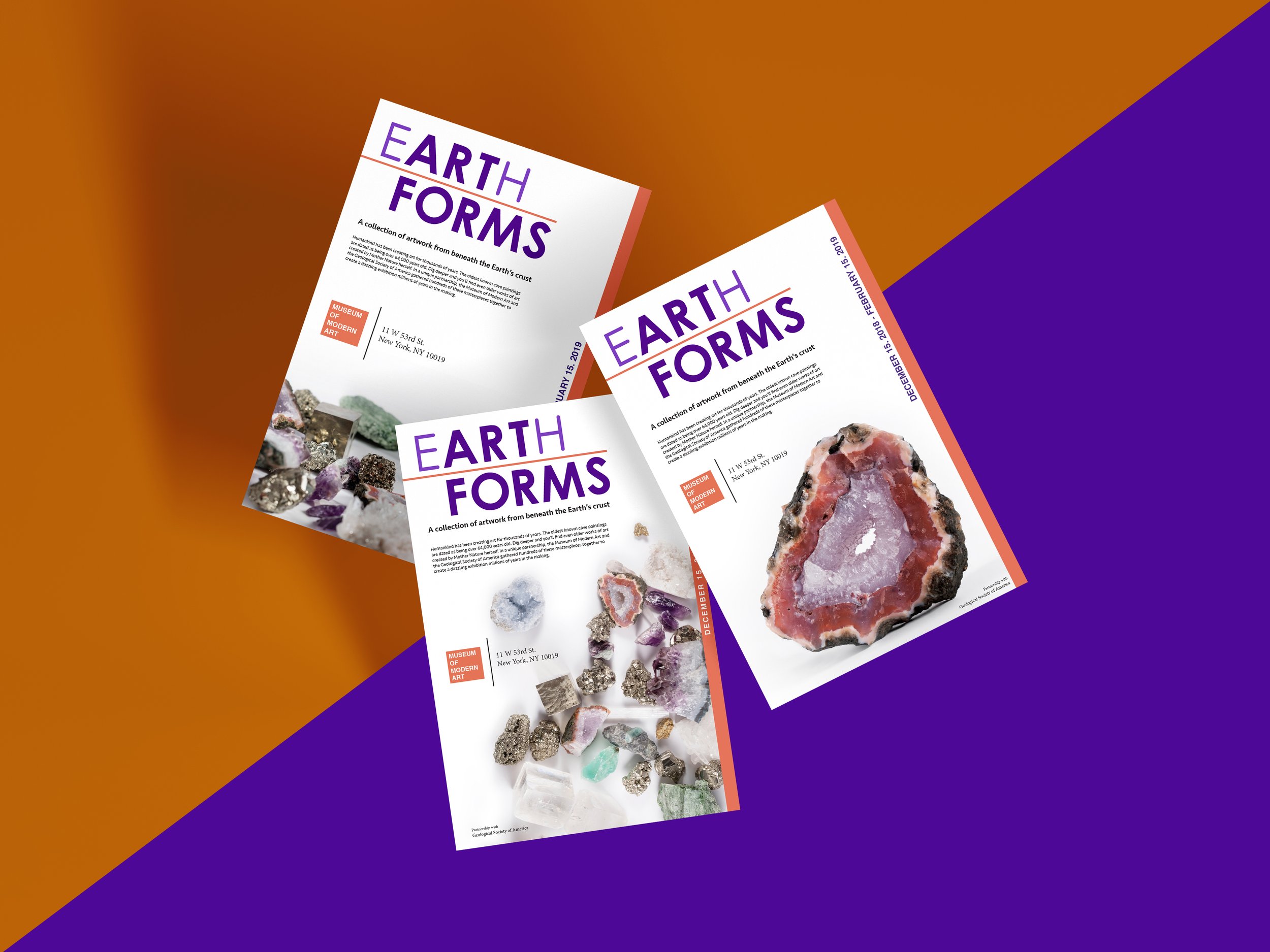
By using my mineral collection as the centerpiece of a hypothetical exhibit at New York’s Museum of Modern Art, this project called for the development of marketing materials to promote this unconventional art show.
-
Humankind has been creating art for thousands of years. The oldest known cave paintings were made over 64,000 years ago. Dig deeper and you’ll find even older works of art created by Mother Nature herself. In a unique (and hypothetical) partnership, the Museum of Modern Art and the Geological Society of America gathered hundreds of these masterpieces together to create a dazzling exhibition millions of years in the making.
-
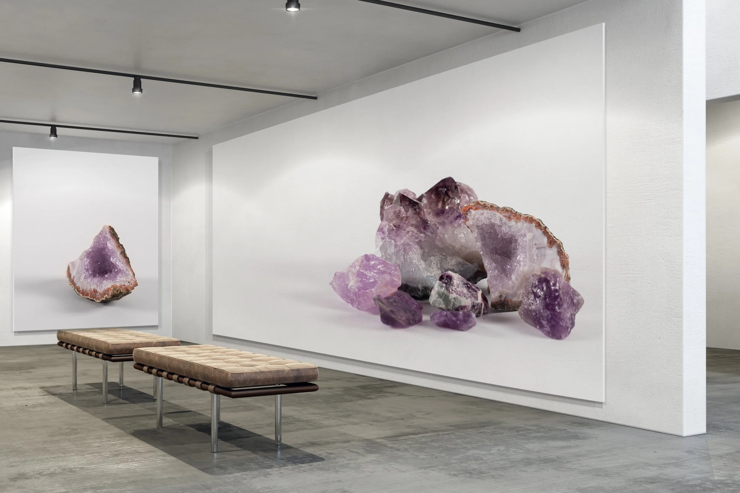
The point of this project is to make something that wouldn’t normally be in an art museum look like it belongs there. When photographing my collection, I wanted to present the minerals in a clean white space in order to make sure that museum patrons would focus on the forms of the rocks themselves and create the atmosphere of an art gallery.
-
For the wordmark I wanted to play on the fact that the word “art” is in the word “earth.” It’s a bit of cliche, but ultimately I felt that it worked along with the word “forms” in helping capture the idea that these forms created by the earth are also the art forms at the center of this art exhibit.
The colors - purple and orange - were taken from the amethyst geode slice that became the “mascot” mineral of the show.
-
The project brief required a poster design and a brochure design. I ended up making a series of poster designs to show off the diversity of the collection.

Humankind has been creating art for thousands of years. The oldest known cave paintings were made over 64,000 years ago. Dig deeper and you’ll find even older works of art created by Mother Nature herself. In a unique (and hypothetical) partnership, the Museum of Modern Art and the Geological Society of America gathered hundreds of these masterpieces together to create a dazzling exhibition millions of years in the making.
The point of this project is to make something that wouldn’t normally be in an art museum look like it belongs there. When photographing my collection, I wanted to present the minerals in a clean white space in order to make sure that museum patrons would focus on the forms of the rocks themselves and create the atmosphere of an art gallery.


For the wordmark I wanted to play on the fact that the word “art” is in the word “earth.” It’s a bit of cliche, but ultimately I felt that it worked along with the word “forms” in helping capture the idea that these forms created by the earth are also the art forms at the center of this art exhibit.
The colors - purple and orange - were taken from the amethyst geode slice that became the “mascot” mineral of the show.
The project brief required a poster design and a brochure design. I ended up making a series of poster designs to show off the diversity of the collection.

